Improved the onboarding experience and content strategy to support first-time AI users across UW's campus.

TL;DR
Onboarding a campus to AI for the first time
Purple is UW's secure, university-exclusive AI platform, planning to be launched to the entire campus community in mid 2026.
For staff and faculty encountering AI tools for the first time, day one was disorienting — they didn't know which agent to use, what they were allowed to share, or where to even start.
As the sole UX designer, I led the end-to-end onboarding experience: from a pre-launch accessibility and usability audit, to first-time user research, to the content and in-product design that shipped with launch.
Impact: Onboarding improvements shipped ahead of soft launch reduced first-time friction and agent confusion. Early beta signals showed users reaching their first successful interaction more quickly and with less confusion than in pre-launch testing.

Purple - UW’s custom AI platform (by 2025.12)
Role
UX Design, Research, Strategy
Teams
UW-IT Data & Engineering, Research, Comms, Web, Documentation;
Vendor Project Manager
Timeline
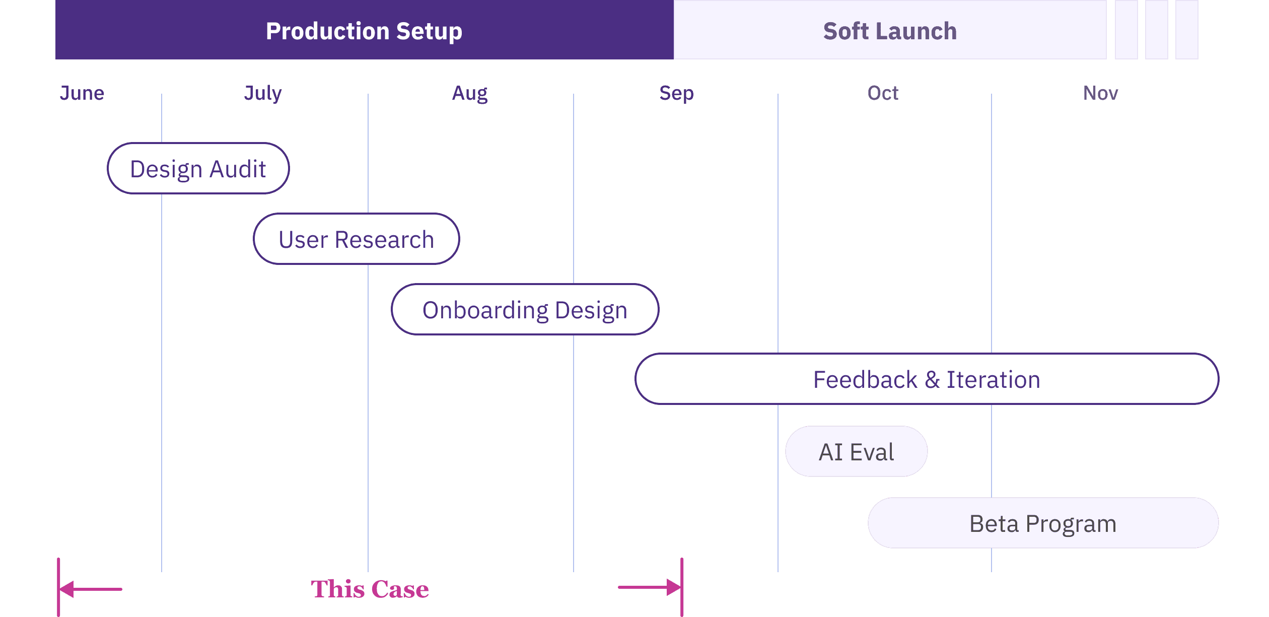
Jun - Sep 2025
Skills
AI & Agentic UX
Prompt Engineering
AI Eval
Heuristic Evaluation
Accessibility Audit
The Context
A campus-wide rollout with no UX foundation
I joined as the first UX designer on a technically-run team, two months before soft launch. The product was a third-party platform, meaning UI changes had to go through a vendor rather than built in-house. The cross-functional team for this project was just forming.
"Assume the customer knows nothing and has only tried ChatGPT once before. That is our target. We want to encourage their adoption."
— My manager Jared (UW-IT AI Lead)
The problem
Logging in with no idea where to start
For many UW staff and faculty, AI had been off-limits at the university until now. So when Purple launched, users would land on a screen full of specialized "agents" with no clear signal of which one to pick, what to type, or whether it was even safe to share their work there.
The question wasn't whether people would find Purple powerful. It was whether they'd be supported and stay long enough to find out.
How Might We design an experience that earns trust and drives first-time success, for users who've barely touched AI before?
Project Timeline
Note: This case is part of a larger Purple rollout project spanning Summer–Fall 2025. It focuses on the onboarding and usability work from Summer. The Fall work — AI evaluation, feedback loop design, and response quality — is documented separately. Feel free to reach out if you are interested and I'm happy to share in our conversation.
challenge
No baseline data on the main target users
The Purple pilot program, while gave us feedback, was run among AI power users — technically fluent people who understood AI and were building their own agents.
But our actual rollout audience, particularly UW staff encountering AI for the first time, looked nothing like them. We had no data on how they'd react, what they'd expect, or where they'd get stuck.
strategy
Interface comes before intelligence
Faced with high ambiguity and no baseline data on general users, I recognized that a successful AI product experience depends on two distinct layers — the interface people land on, and the intelligence they get back. Fixing one without the other wouldn't be enough.
But with a tight pre-launch timeline, I had to prioritize my efforts: focus first on the product interface — what users land on — before diving deep into AI interactions. Both mattered, but friction in the interface would stop users before they ever reached the AI.
Establishing the baseline before rollout
I audited Purple's interface against accessibility standards and benchmarked it against familiar AI tools (Claude, Perplexity, Copilot, etc.) to identify where Purple broke expected patterns, and the friction points most likely to derail first-time success.
Turning findings into prioritized vendor action
The findings went into a prioritized backlog for the vendor: 20+ accessibility fixes and 30+ UX/UI issues, each with a clear problem statement, recommended solution, and severity rating.

Prioritized UX + Accessibility issue backlog delivered to vendor (excerpt)
Outcome:
Reduced launch risk with vendor-shipped fixes
The prioritized backlog helped the vendor move quickly on launch-critical issues. By working with the vendor, we resolved high-priority blockers, improving product usability and reducing compliance risk ahead of rollout.
Gathering insights from first-time users
While the audit addressed technical quality, it couldn't tell us what we really needed to know: how a first-time user would think and feel walking in.
Method:
Moderated formative usability testing
I conducted 7 moderated 1-on-1 sessions, combining task-based usability walkthroughs and semi-structured interviews, with AI novices across job roles.
Across sessions, I aimed to:
uncover their mental models, expectations, concerns for Purple and AI use
evaluate user comprehension on how to select and use specialized agents.

Affinity map of user insights,
including comm reqs, onboarding needs, agent feedback
Insights informed designs, and rollout decisions.
I synthesized the data into an affinity map, clustering findings across product UX/UI, onboarding and training needs, agent comprehension and discoverability, and broader expectations, concerns, and desired use cases for AI.
These insights not only informed design & engineering decisions but shaped our cross-functional rollout plan, providing the evidence needed for our Communications and Training teams to support users on day one.
1. Data privacy and compliance are top-of-mind concerns.
Users wanted clear reassurance about data privacy, retention/storage, and usage/compliance guidelines, and were skeptical without institutional confirmation. Trust information should be highly visible and easy to find early.
2. Agent selection creates choice overload and blocks first-time success.
Users struggled to understand how agents differed and which one to choose, often misunderstanding purpose or functionality. Clearer onboarding and discovery guidance would reduce friction and speed time-to-value.
3. First-time users need confidence-building guidance.
When agent capabilities aren’t explicit, users default to probing and comparing agents to figure out what works, undermining confidence. Onboarding should make agent purpose and first steps obvious to reduce uncertainty and make the first interaction feel safe and easy.
Design Solution
Meeting users at each friction point
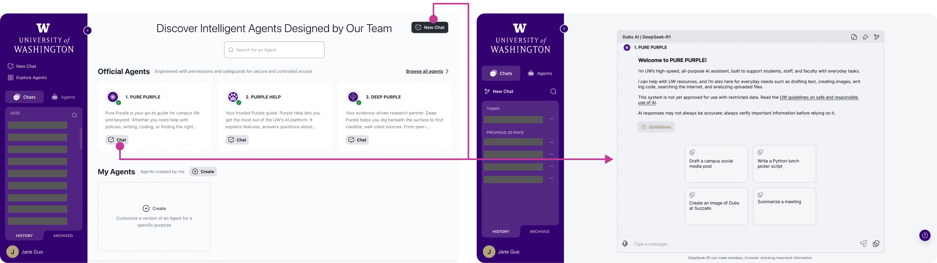
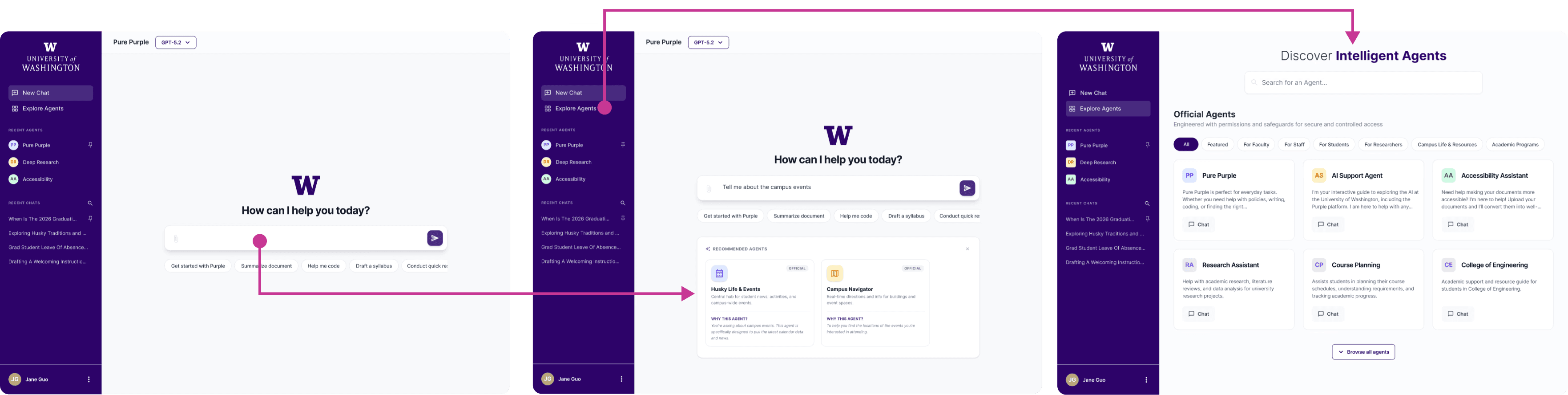
Because the third-party interface offered limited flexibility for UI changes, I leaned into content design, and worked in collaboration with the Comms and Documentation teams. I mapped out a series of onboarding touchpoints to guide users through the journey, and each addressed a specific friction observed in testing.

Onboarding Flow
1
“Get Started” KB article
—
start before users log in
New users would enter Purple from UW-IT announcements and documentation, so the “Get Started” article becomes the first impression for many first-time users. I drafted the article structure and content to answer the questions users had before they feel ready to click into the product.
Goal: Help new users form the right expectation, learn the basics quickly, and feel safe to try Purple.
✍️ What I included and why:
Step-by-step onboarding to compensate for limited in-product walkthrough.
Explain "agent" and their differences to lower barriers and set expectations.
Privacy & compliance notes to address trust concerns early.
Tips for asking good questions to reduce blank-page anxiety and improve first outcomes.

"Get Started" KB Article
Feel free to check out the full article here!
2
In-product usage guidelines
—
make safety visible
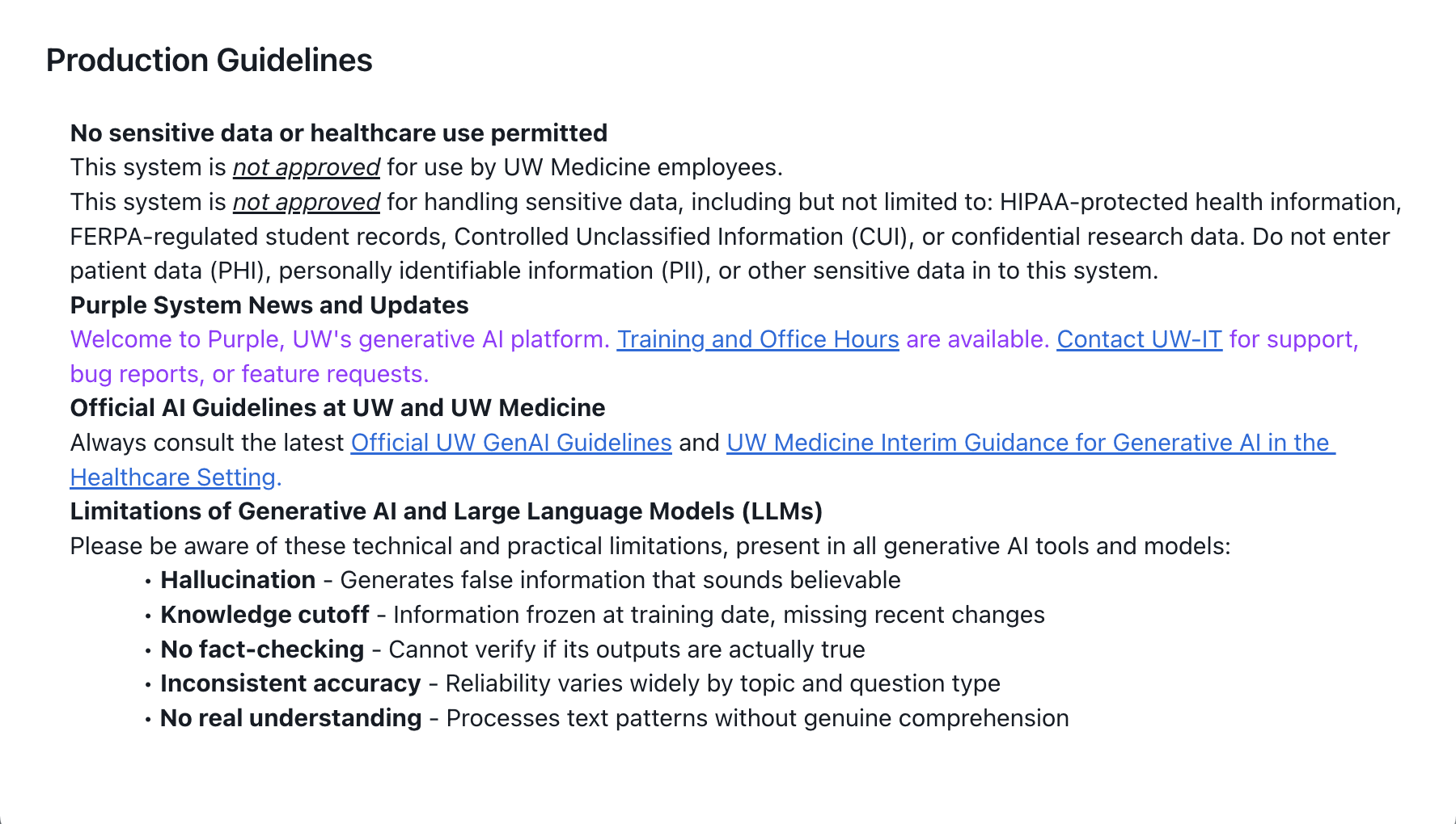
In early versions, the usage guidelines were mostly listing external links to broader GenAI policy pages. In testing, users wanted a clear answer right away—especially around what data is stored, where it lives, and what not to enter.
Goal: Make safe-use expectations and data handling understandable in the moment, not behind external links, to help users feel confident using the tool responsibly.
✍️ What I changed:
Pulled the most important policy information into the product with clear hierarchy, so users don’t have to leave Purple to understand basic safety.
Added plain-language clarity around data retention and approved data types, aligned with concerns surfaced in research.
Before
Dense text; key information linked to external policy pages
After

Key policy information shown in the context
3
Agent descriptions
—
reduce the agent selection burden
In testing, the unclear descriptions made it confusing for users to choose the right agent for their needs. I collaborated with Comms to rewrite the “on-hover” (directory) descriptions and the in-chat descriptions to be consistent, credible, and easy to skim.
Goal: Help users choose the right agent to start chatting with by clarifying scope, strengths, and limitations.
✍️ Design Principles:
Clearly communicate each agent’s purpose, best-fit tasks, and boundaries
Keep tone consistent, credible, and user-friendly across agents
Before

Long, buzz-word heavy, and generic claims
After

More scannable and focused description
4
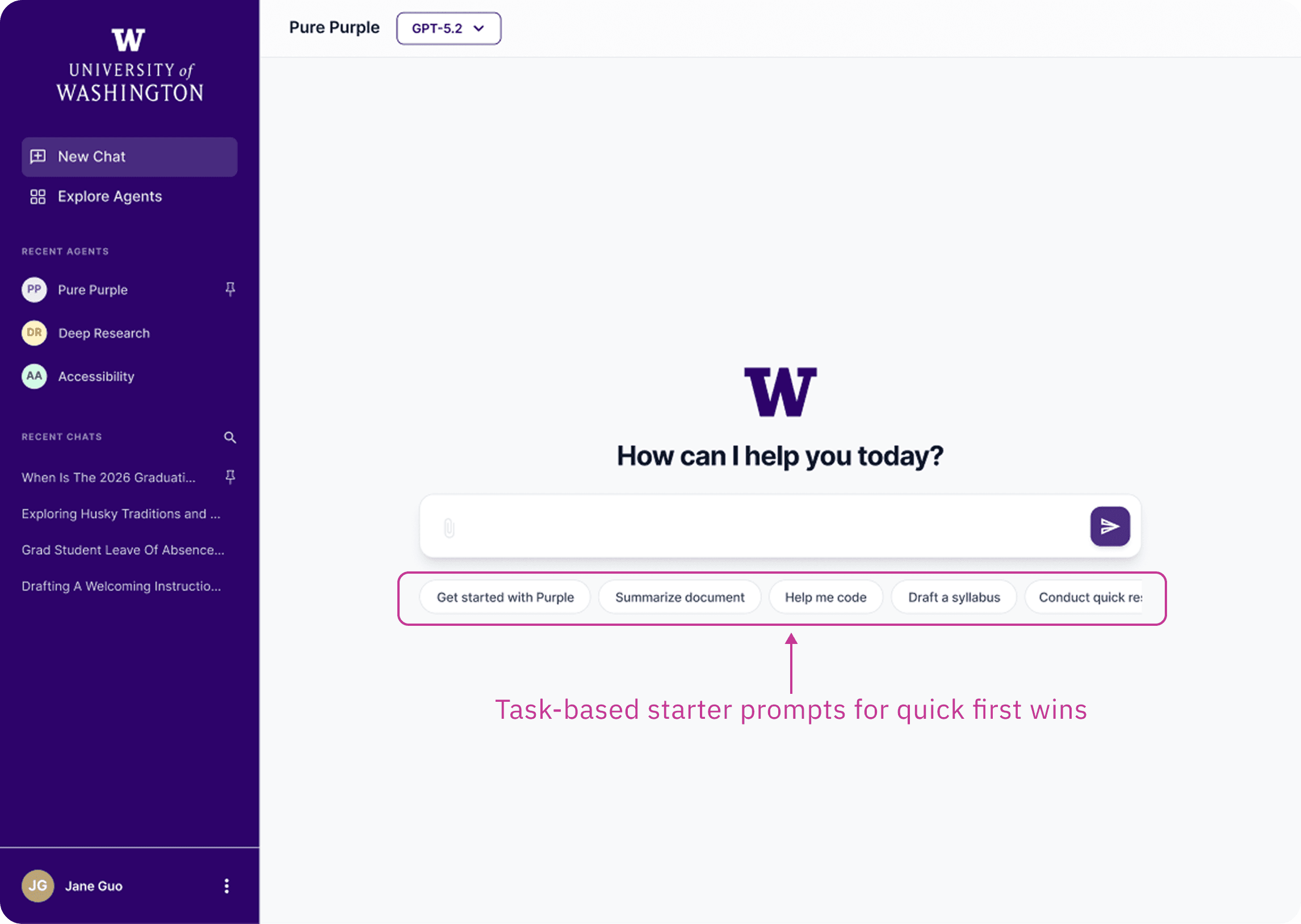
In-chat starter prompts
—
a first win within half a scroll
In testing, some prompts felt too role-specific, leaving users unsure whether the agent could help them. Others triggered responses long enough to feel overwhelming on a first interaction. I refined the prompts to demonstrate core capabilities and keep the first exchange lightweight.
Goal: Help first-time users get a quick win without feeling overwhelmed or excluded.
⚠️ Key Constraints:
UI limit: The UI supports max 4 prompt slots per agent.
Audience: Official agents serve broad UW audiences (staff/faculty/students) and general tasks, so prompts should be understandable without assuming a specific role or context.
✍️ Design Principles:
I grounded my design principles in testing insights and prompt UX guidance and best practices (article from NN/G).
Role-neutral & inclusive phrasing so prompts don’t feel “for staff only” or “for students only”
Show capability and set expectations (what this agent is good for)
Short enough that the first response stays within ~0.5 page scroll
Before

Too random or role-specific prompts
After

More task-relevant, role-neutral starters that set expectations
For Prompt Iteration:
Given the 4-slot limit, as Purple rolls out to new audiences and more agents are added, we’ll refresh starter prompts based on the most common user intents and early friction we observe, so prompts stay relevant and lightweight.
Results
Positive signals from the beta
The onboarding improvements helped reduce confusion during Purple’s beta launch. Compared to early usability testing where most participants struggled to understand agents, beta feedback showed significantly fewer reports of agent-selection confusion.
Agent confusion dropped sharply: In pre-launch testing, 6 of 7 participants flagged unclear agent purposes as a blocker. During soft launch and beta, we received almost no feedback about agent confusion.
Faster time to first value: Users in beta reported reaching a first successful interaction more quickly and with more confidence than participants in pre-launch testing.
Reduced compliance and usability risk before launch: High priority accessibility and usability fixes were shipped ahead of rollout in collaboration with the vendor.
Future Direction
Starting with a task, not a tool
While the current onboarding improvements reduced friction, a deeper issue remained: users were required to choose an agent before understanding what each agent could do. The current experience was tool-first, not task-first.
To address this, I explored a redesigned entry model that shifts the starting point from selecting an agent to starting a task, allowing the system to assist only when context becomes clear.
I shared this concept direction with the vendor product team as a forward-looking direction.
Before
Current Flow: Choose Agent → Chat → Try to figure it out
After
Redesigned Flow: Start Task → System Guides User → Refine Agent Choice
Start with a task, not an agent
Instead of landing on a menu of agents to start with, users begin in a single default chat with a general-purpose agent. This removes the upfront selection burden and allows users to start with a task rather than a tool.
Starter prompts demonstrate common tasks and help users achieve a quick first win without overthinking.
✍️ Why this works
Reduces first-click cognitive load
Enables immediate interaction
Delays specialization until context is clearer
Aligns with industry standard interaction patterns users already expect
Begin with common tasks instead of selecting an agent
Explore agents when needed
Manual browsing specialized agents remains available, but it is no longer required as the first step.
The agent directory becomes structured instead of flat. Filters based on role and task topic would help narrow choices and reduce overwhelm, especially as the number of agents grows.
This supports users who want more control or need a specialized tool, without forcing every user into that decision upfront.
✍️ Why this works
Makes exploration intentional rather than mandatory
Surfaces user context to reduce cognitive load
Scales as the ecosystem grows
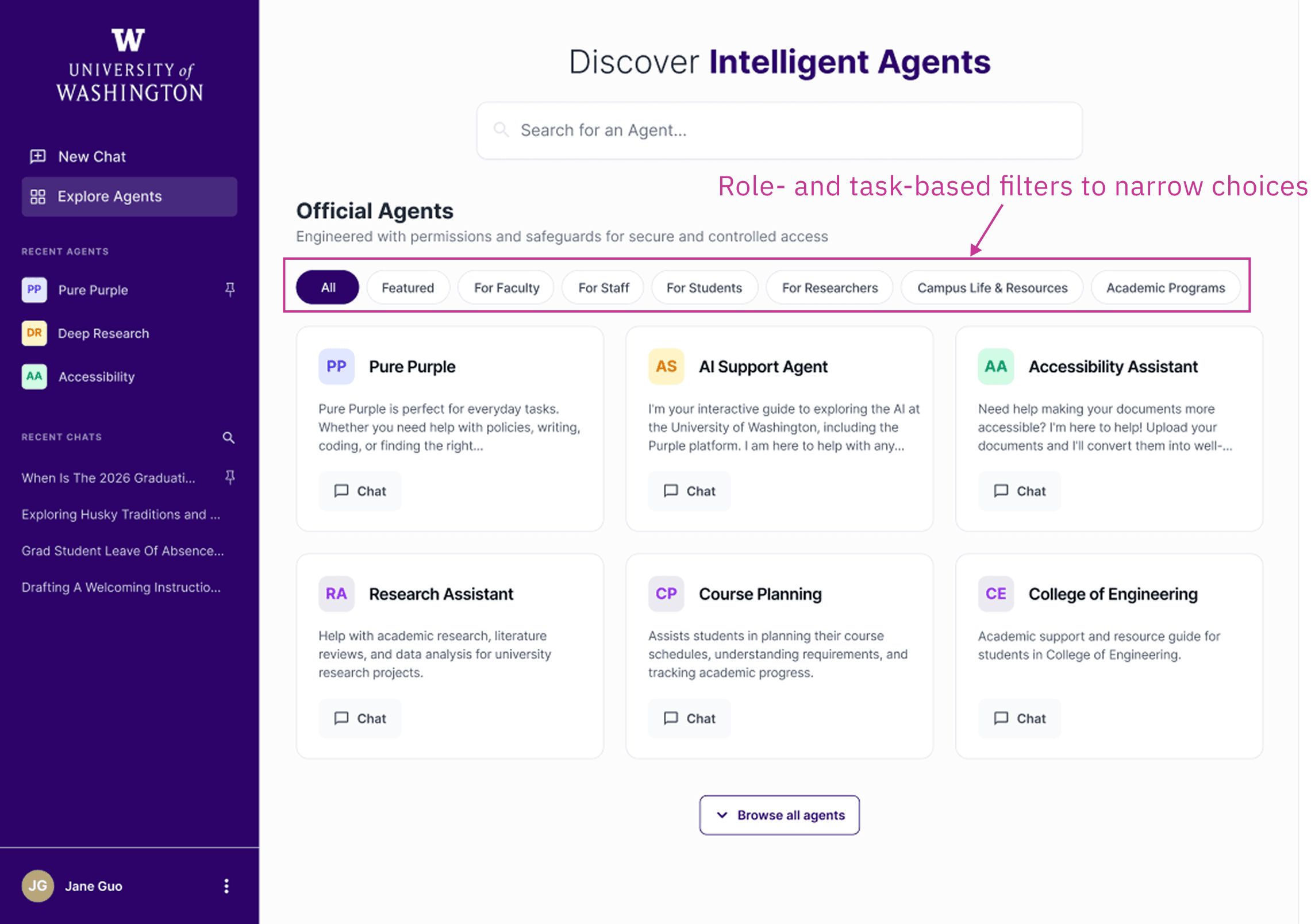
Structured browsing instead of a flat agent list
Let the system guide specialization
As a future-facing direction, the system can suggest a more specialized agent based on user intent within the chat. Rather than requiring users to manually select an agent, the system assists once context is clear. Importantly, this is a system recommendation rather than an automatic switch, so that user control is preserved.
Over time, AI assistance becomes the primary path, while manual exploration remains available as a fallback option for transparency and control.
✍️ Why this works
Shifts selection from manual to AI-assisted
Reduces decision fatigue
Preserves user agency

Context-based agent recommendation
The shell vs. the brain
Through testing I found something that reshaped how I think about AI product design: utility is the primary driver of perceived usability.
While participants initially struggled with friction in-app navigation, their post-task feedback was overwhelmingly positive. Once they reached the "Aha!" moment—receiving a high-quality, relevant answer—they retroactively perceived the entire system as "simple and intuitive”.
This proved that while the "Shell" (the UI/UX) required maintenance, the "Brain" (the AI performance) was what mattered most to the user experience.
As the project moved into the soft-launch phase in Fall 2025, I carried this insight forward, shifting my focus to improving agent response quality, grounding, and evaluation. Feel free to reach out if you'd like to learn more about my work in the fall!